Your emails, optimized for every screen with responsive design
Steve Bazyl
Developer Programs Engineer, Google Apps
Pierce Vollucci
Associate Product Manager, Gmail
When you send emails, your recipients might read them on a computer, tablet, or phone—or more likely, all three. However your message might look different on all these devices. Later this month, you’ll be able to use CSS media queries with Gmail and Inbox by Gmail to ensure that your message is formatted the way you intended, whether it's viewed on a computer, a phone in portrait mode, or a tablet in landscape mode. You’ll be able to change styles based on width, rotation, and resolution, allowing for more responsive formatting to optimize your email for every device.
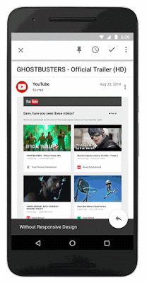
Example of an email before and after responsive design
In discussions with email designers, these supported CSS rules were identified as the most useful media queries to support responsive design. This is just one part of an overall effort to expand CSS support in Gmail and to give email designers more control over how their messages are rendered. For example, the CSS below applies the color red when the screen width exceeds 500px.
You can find the full list of supported CSS rules in the developer documentation. We hope this reference helps you create more feature-rich, responsive email for users. Happy formatting!